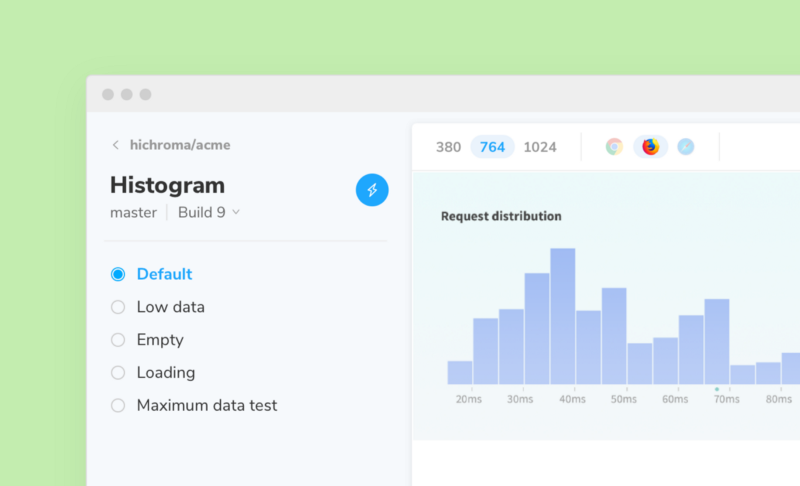
Responsive UI component testing
Test multiple viewports and set capture delay
From simple button to responsive screen anything can be a component. Today’s release features two Chromatic APIs that open up infinite testing possibilities:
- 📱
viewportsallows you to assign screen sizes for testing responsive UI components. It’s useful for folks who assemble complex features and screens using components. - ⏱
delayallows you to postpone snapshotting for a fixed amount of time. It’s useful if you have JavaScript triggered animations (e.g., modals, “animate in”) or need to wait on third-party functionality.
Chromatic piggybacks on Storybook 4.0’s new parameters API to provide a seamless developer experience that’s also future-friendly. Update storybook-chromatic package to get the new features. Our goal is to expand UI test coverage with less work.

Viewports for responsive UIs
Developers create UI components that can respond to any device width. The new viewports parameter helps you define one or more viewport sizes to capture your component in.
You can assign viewports to a story, component, or even an entire Storybook. Here’s an example of of adding viewports to a story:
storiesOf(‘MyComponent’, module)
   .add(‘story’, () => <MyComponent with=”props” />, {
   chromatic: { viewports: [320, 1200] },
});
This tells Chromatic to capture your component at 320px and 1200px viewport widths. There are no extraneous imports or external dependencies.
Learn more about using viewports here →

Delay snapshotting
Components sometimes trigger custom interactions on render. For example, JavaScript-driven animations. With delay you can tell Chromatic to wait for a fixed time to allow your story to get into the intended state. Here’s an example of setting delay on a story:
storiesOf(‘MyComponent’, module)
   .add(‘story’, () => <MyComponent with=”props” />, {
   chromatic: { delay: 300 },
});
This postpones snapshotting for 300ms while your component is getting presentable.
Read more about using delay here →
Bug fixes and improvements
🔄 Smart retry for resource loading
In rare cases, resources such as images and fonts fail to load which leads to incorrect snapshots. We now intelligently retry to give assets more chances to load.
📦 storybook-chromatic
The package has improved Windows support, fixes for Node v6, and can capture stories with <canvas> element
📚 Support for —-storybook-build-dir (beta)
If you’re already building a copy of your Storybook, use this to upload your built Storybook to our servers. This means your builds will be faster and even more reliable.
Chromatic for Storybook — by Storybook maintainers
Our goal is to make automated visual testing in Storybook seamless. Each release, we build features to expand your UI test coverage while also saving you time and getting out of the way. It’s quite complex to build a product this simple.